I’ve fallen in love with the covers of all three of my published novels, and you can see why:
Aren’t they gorgeous? I’ve been lucky. It doesn’t take a special study to know that book covers matter. A good cover inspires a potential reader to pick up the book to learn more; a bad cover barely registers as the book browser moves on to a different title.
Some people believe that originality and a fresh approach are key to producing good book covers. That’s not entirely true. While we have a tendency to scorn cliches, there’s a reason that certain images, colors, and fonts are used repeatedly. A book’s cover, after all, exists primarily to help market the book. It gets about three seconds of our attention to do that. One quick glance at that cover should not only make a good first impression but should help the reader categorize the story within the pages as well. Using elements familiar to particular genres triggers instant recognition in our brains. That’s one reason you won’t find elegant, flowing font and pastel colors on the cover of a tense thriller, or big, blocky fonts and gun illustrations on a romance. Sticking to general design standards for a particular genre lets a reader instantly know what sort of book to expect; connecting cover imagery to books that have been successful in the past further encourages that reader to take a chance on a new title.
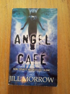
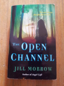
You can tell a lot by looking at my three book covers. With the otherworldly nature of their illustrations, ANGEL CAFE and THE OPEN CHANNEL imply some supernatural chills. ANGEL CAFE in particular has some pretty spooky font going on, and if that didn’t communicate the nature of the book, the tagline would help: “Some spirits are best left alone.” The mood continues for THE OPEN CHANNEL, although the font here has a slightly medieval feel, telegraphing the fact that part of the story takes place in the 14th century.
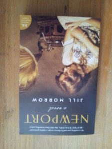
If you guessed from their covers that my first two books belong to a different genre than NEWPORT does, you were correct. NEWPORT is historical fiction, and its cover evokes its era (the story is set in 1921).
Just as we know what we like when we see it, we also know what we DON’T like. If a great book cover can encourage sales, the unfortunate downside is that a poorly designed cover can become the butt of jokes. It was only a matter of time in our internet-saturated world before a website like this happened.
NEWPORT’s cover was designed by Amanda Kain. ANGEL CAFE’s cover was illustrated by David Stevenson, who also designed the cover of THE OPEN CHANNEL. I am indebted to them for keeping me off of that website.


